Colour consistency in flexible packaging is rarely about taste or opinion. In reality, it is a process control issue that sits right at the intersection of materials, printing technology, and decision-making. Most colour disputes between buyers and suppliers do not happen because something went wrong on press. They happen because expectations were never defined clearly enough at the start.
Printed pouches, particularly digital printed pouches, behave very differently from rigid packaging or paper-based products. Film substrates, ink systems, and surface finishes all influence how colour appears, and these influences cannot be “designed away” in artwork. When buyers and suppliers align early on how colour will be controlled, measured, and approved, colour stops being a recurring headache and becomes a predictable outcome.
Colour Consistency is a Managed Outcome
In digital printed pouches, even small colour variations can stand out immediately, especially when multiple batches sit next to each other on shelf. Flexible films reflect light differently depending on gloss level, transparency, and laminate structure, which means colour perception is never static. What looks perfectly fine in isolation can suddenly feel “off” when compared across runs.
Retailers and brand teams tend to judge colour visually, not instrumentally. From a production perspective, that means colour consistency is judged by perception, not just numbers. If acceptable limits are not agreed in advance, perfectly printable results can still end up being rejected. This is why colour consistency needs to be addressed as part of the technical specification, not as an informal expectation.
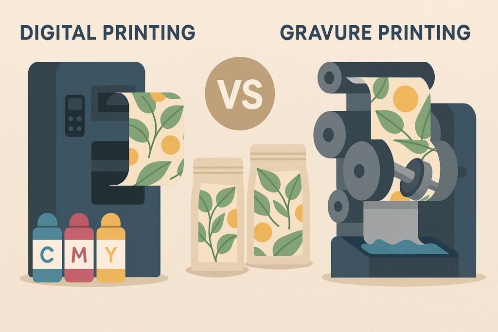
Digital Printing vs Gravure Printing
Digital printing pouches are built on software-driven colour management rather than mechanical repeatability. Unlike gravure or flexo, where ink volume is physically defined by engraved cylinders or plates, digital systems rely on calibrated profiles and controlled ink deposition. That brings flexibility and speed, but it also means colour stability depends heavily on keeping the whole system stable.
From a print management point of view, digital printing delivers very reliable results when the substrate, ink set, and profiles remain consistent. Where problems arise is when digital is expected to behave like gravure, particularly in deep solids or highly saturated brand colours. Digital printing is not worse, just different, and once that difference is understood, expectations become much easier to manage.
Colour Reference Standards for Printed Plastic Bags and Pouches
One of the most common misconceptions in packaging is that a PDF is a colour reference. It is not. Screens are backlit, films are reflective, and no monitor can simulate how ink behaves on a laminate. For printed plastic bags and pouches, the only meaningful colour reference is a physical print produced on the final material structure.
Buyers and suppliers must be aligned on what the master reference actually is. This might be a previously approved pouch, a dedicated press proof, or a controlled production sample. Once approved, that reference must be treated as the benchmark for all future discussion. Without a physical reference, colour approval becomes subjective and impossible to defend.
Colour Tolerances in Digital Print
There is no such thing as zero variation in industrial printing. The role of professional packaging pouches services is not to promise perfection, but to define what is acceptable and then stay within it. Colour tolerances exist because processes move slightly, even when everything is done correctly.
For critical colours, instrumental measurements such as Delta E can be useful, but they are not the full story. Human perception still matters, especially on flexible packaging where light reflection plays a big role. This is why tolerance levels, assessment methods, and decision authority must be agreed before production starts, not after a batch lands in the warehouse.
Substrate Influence on Colour
In flexible packaging, colour does not exist independently of the substrate. Film type, thickness, surface treatment, barrier layers, and finish all affect how ink sits and how colour is perceived. A colour approved on one laminate will not reproduce identically on another, even if the artwork and press settings remain unchanged.
This becomes particularly relevant when sustainability-driven changes are introduced, such as downgauging or adding recycled content. Any material change, however small it seems, should trigger a colour revalidation. Treating substrate changes as neutral from a colour perspective is one of the fastest ways to create avoidable problems.
Variable Data Printing
Variable data printing is one of the biggest advantages of digital printed pouches, allowing batch codes, QR codes, serialisation, and design variations within the same run. From a technical standpoint, these elements are generated dynamically and do not always share the same colour build as static artwork elements.
Buyers should understand that variable elements are optimised for clarity and function rather than exact colour matching. Fine text and small graphics behave differently due to resolution limits and ink control. As long as legibility and contrast are maintained, slight visual differences are normal and should be expected.
Batch-to-Batch Colour Control
Consistent colour across multiple runs is achievable, but only when process variables are locked down. Using the same press, ink set, colour profiles, and substrate supplier is critical for maintaining stability in digital printing pouches. Any change increases the risk of colour drift, even if it seems minor.
From an operational perspective, approved physical samples should always be retained and referenced for repeat orders. Colour data and profiles should be archived and reused rather than recreated. Treating repeat orders as fresh projects undermines consistency and usually costs more time in the long run.
Proofing Hierarchy in Packaging Printing
Not all proofs serve the same purpose. Soft proofs are useful for layout and content checks, but they are not colour-accurate. Press proofs and production samples provide progressively more reliable colour information, but only when produced on the final substrate using the intended process.
Problems arise when proof approvals are vague. Approving a proof “in principle” without defining what has been approved creates confusion later. Clear approval scopes keep everyone aligned and prevent colour discussions from becoming emotional rather than technical.
Responsibility Definition
Colour control works best when responsibilities are clearly defined. The packaging supplier should control the print process, but the buyers should also control approval decisions. Issues arise when approvals are informal, undocumented, or given by multiple stakeholders.
From a print management perspective, there should be one authorised colour sign-off per project. Any deviation should be assessed against agreed tolerances, not personal preference. This keeps discussions factual, fair, and focused on process rather than blame.
Colour Consistency in Gravure Print
Gravure printing is still the gold standard for long-run colour consistency in flexible packaging. Its strength lies in mechanical repeatability, with engraved cylinders delivering highly stable ink volumes once the process is properly set. For very high volumes, this stability is difficult to match. That said, gravure colour consistency depends heavily on cylinder engraving accuracy, ink formulation, viscosity control, and press condition. Colour adjustments are slower and more expensive than in digital printing, often requiring cylinder changes or ink reformulation. The payoff is excellent long-term consistency once everything is locked.
For gravure projects, buyers must think long term from the start. Colour references, cylinder ownership, storage conditions, and repeat-run procedures should all be agreed upfront. When managed correctly, gravure delivers exceptional consistency for large-scale printed plastic bags and pouch production.
How Aropack Packaging Manages Colour Consistency
At Aropack, colour consistency is treated as part of the overall production system, not as a standalone issue. Substrate selection, print technology, colour profiling, and approval workflows are all aligned before production begins. This applies across both digital printed pouches and gravure printed formats.
By working closely with buyers at specification stage, we eliminate assumptions and reduce colour-related risk. This is why we operate not just as a packaging company, but as a technical partner that understands how colour behaves in real-world flexible packaging production.
Conclusion
Colour consistency in printed pouches does not happen by accident. It is the result of clear specifications, controlled materials, realistic tolerances, and disciplined approval processes. Whether using digital printed pouches for flexibility or gravure printing for scale, colour must be treated as a technical parameter that is engineered and managed.
When brands work with a packaging supplier that understands both print technologies and material behaviour, colour stops being a recurring risk. With the right technical approach, as applied by Aropack, colour consistency becomes a reliable outcome that holds up not just on the first run, but across the full lifecycle of the packaging.
Give us a call on 01233 281460 or send us an email at info@aropack.co.uk for a free consultation.